

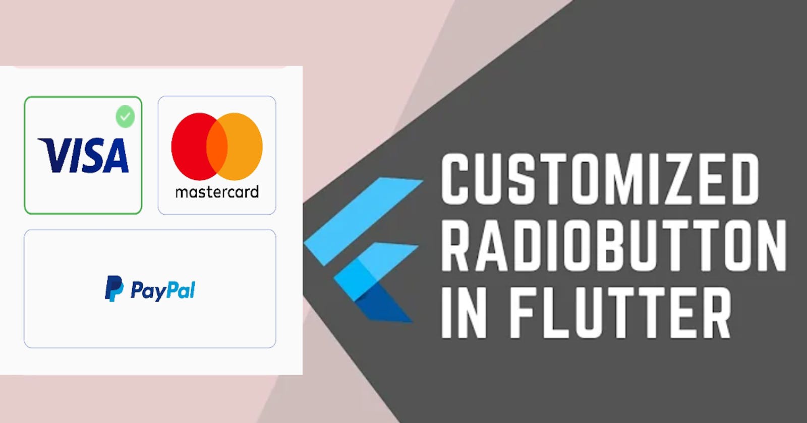


This tutorial will help you to understand how to create a group of custom radio buttons. Radio buttons are buttons that can be used to choose from different options.
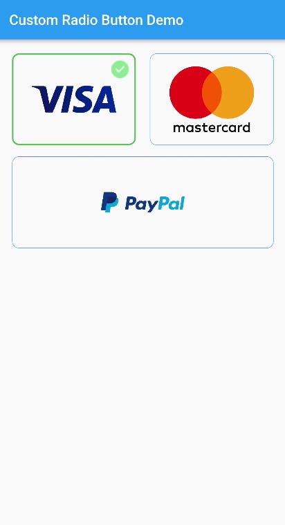
So, we are creating this screen below:
Prerequisites
Basic knowledge of Dart programming language.
Familiarity with Flutter framework and its widgets.
A working installation of Flutter SDK and Android Studio or VS Code
Understanding of Stateful widgets and their role in managing state in a Flutter app.
Basic knowledge of layout and positioning in Flutter
Familiarity with using image assets in Flutter.
Tutorial
Open any of the IDE. Create a flutter project (Application) and name the project any name of your choice.
After the project is created, run the application on your device or emulator.
Download the three payment platforms' logos and the tick circle icon. I downloaded them from the images on google.
Add the four images to the assets folder or you may need to create the folder at the root of the project folder.
assets/images/
Add the path of the images to pubspec.yaml
 # To add assets to your application, add an assets section, like this:
assets:
    - assets/images/visa.png
    - assets/images/mastercard.png
    - assets/images/paypal.png
    - assets/images/tick-circle.png
In main.dart file, replace your code with the code below. The code sets up a basic Flutter app with an app bar and an empty container on the home page.
import 'package:flutter/material.dart';

void main() {
  runApp(const MyApp());
}

class MyApp extends StatelessWidget {
  const MyApp({super.key});

  @override
  Widget build(BuildContext context) {
    return MaterialApp(
      title: 'Flutter Demo',
      debugShowCheckedModeBanner: false,
      theme: ThemeData(
        primaryColor: const Color(0xFF5C6ED1),
      ),
      home: const HomePage(),
    );
  }
}
class HomePage extends StatefulWidget {
  const HomePage({super.key});

  @override
  State<HomePage> createState() => _HomePageState();
}

class _HomePageState extends State<HomePage> {
    @override
    Widget build(BuildContext context) {
        return Scaffold(
          appBar: AppBar(
            title: const Text("Custom Radio Button Demo"),
          ),
          body: Container();
     }
}
The HomePage class is a stateful widget that has a state object of type _HomePageState. The build() method of this class returns a Scaffold widget, which is a basic visual structure for the app. The Scaffold widget has an AppBar and a body. The AppBar has a title with the text "Custom Radio Button Demo", and the body is an empty Container.
...
class _HomePageState extends State<HomePage> {
  int selectedPayment = 0;

  Widget CustomPaymentCardButton(String assetName, int index) {
    return OutlinedButton(
      onPressed: () {
        setState(() {
          selectedPayment = index;
        });
      },
      style: OutlinedButton.styleFrom(
        padding: const EdgeInsets.symmetric(horizontal: 5, vertical: 5),
        shape:
            RoundedRectangleBorder(borderRadius: BorderRadius.circular(10.0)),
        side: BorderSide(
            width: (selectedPayment == index) ? 2.0 : 0.5,
            color: (selectedPayment == index)
                ? Colors.green
                : Colors.blue.shade600),
      ),
      child: Stack(
        children: [
          Center(
            child: Image.asset(
              assetName,
              fit: BoxFit.contain,
              width: 120,
              height: 120,
            ),
          ),
          if (selectedPayment == index)
            Positioned(
              top: 5,
              right: 5,
              child: Image.asset(
                "assets/images/tick-circle.png",
                width: 25,
                fit: BoxFit.cover,
              ),
            ),
        ],
      ),
    );
  }
...
Inside the _HomePageState which extends State class. There is a variable named selectedPayment that is initially set to 0. It is used to keep track of the selected payment option. There is a method CustomPaymentCardButton takes two parameters, assetName and index. assetName is a string that represents the path to an image asset, and index is an integer that represents the position of the button in a list of payment options.
The method returns an OutlinedButton widget, which is a Material Design styled button with an outlined border. The onPressed callback of the button sets the value of selectedPayment to the index of the button that is pressed.
The child property of the button is a Stack widget that contains an Image.asset widget with the image specified by the assetName parameter. The Stack also contains a Positioned widget that shows a checkmark icon if the button is selected.
The style property of the button is used to set its padding, border shape, and color based on whether it is selected or not. If the button is selected, its border width is set to 2.0, and its color is set to green. Otherwise, its border width is set to 0.5, and its color is set to blue.
...
@override
  Widget build(BuildContext context) {
    return Scaffold(
      appBar: AppBar(
        title: const Text("Custom Radio Button Demo"),
      ),
      body: Padding(
        padding: const EdgeInsets.symmetric(horizontal: 20),
        child: Column(
          children: [
            const SizedBox(
              height: 20,
            ),
            Row(
              mainAxisAlignment: MainAxisAlignment.spaceBetween,
              children: [
                Expanded(
                  child: CustomPaymentCardButton("assets/images/visa.png", 0),
                ),
                const SizedBox(
                  width: 20,
                ),
                Expanded(
                  child: CustomPaymentCardButton(
                      "assets/images/mastercard.png", 1),
                ),
              ],
            ),
            const SizedBox(
              height: 16,
            ),
            CustomPaymentCardButton("assets/images/paypal.png", 2),
          ],
        ),
      ),
    );
  }
...
The body is defined using a Padding widget with a horizontal padding of 20. The padding contains a Column widget that contains a list of payment options.
The Row widget contains two Expanded widgets that each contain a custom payment card button defined using the CustomPaymentCardButton method. The first button shows an image of a Visa card and has an index of 0. The second button shows an image of a Mastercard and has an index of 1. The Row widget is used to display the two buttons side-by-side with an equal width.
The CustomPaymentCardButton method is called again with an image of a PayPal logo and an index of 2 to display a third button below the Row.
The overall code is the code below:
import 'package:flutter/material.dart';

void main() {
  runApp(const MyApp());
}

class MyApp extends StatelessWidget {
  const MyApp({super.key});

  @override
  Widget build(BuildContext context) {
    return MaterialApp(
      title: 'Flutter Demo',
      debugShowCheckedModeBanner: false,
      theme: ThemeData(
        primaryColor: const Color(0xFF5C6ED1),
      ),
      home: const HomePage(),
    );
  }
}

class HomePage extends StatefulWidget {
  const HomePage({super.key});

  @override
  State<HomePage> createState() => _HomePageState();
}

class _HomePageState extends State<HomePage> {
  int selectedPayment = 0;

  Widget CustomPaymentCardButton(String assetName, int index) {
    return OutlinedButton(
      onPressed: () {
        setState(() {
          selectedPayment = index;
        });
      },
      style: OutlinedButton.styleFrom(
        padding: const EdgeInsets.symmetric(horizontal: 5, vertical: 5),
        shape:
            RoundedRectangleBorder(borderRadius: BorderRadius.circular(10.0)),
        side: BorderSide(
            width: (selectedPayment == index) ? 2.0 : 0.5,
            color: (selectedPayment == index)
                ? Colors.green
                : Colors.blue.shade600),
      ),
      child: Stack(
        children: [
          Center(
            child: Image.asset(
              assetName,
              fit: BoxFit.contain,
              width: 120,
              height: 120,
            ),
          ),
          if (selectedPayment == index)
            Positioned(
              top: 5,
              right: 5,
              child: Image.asset(
                "assets/images/tick-circle.png",
                width: 25,
                fit: BoxFit.cover,
              ),
            ),
        ],
      ),
    );
  }

  @override
  Widget build(BuildContext context) {
    return Scaffold(
      appBar: AppBar(
        title: const Text("Custom Radio Button Demo"),
      ),
      body: Padding(
        padding: const EdgeInsets.symmetric(horizontal: 20),
        child: Column(
          children: [
            const SizedBox(
              height: 20,
            ),
            Row(
              mainAxisAlignment: MainAxisAlignment.spaceBetween,
              children: [
                Expanded(
                  child: CustomPaymentCardButton("assets/images/visa.png", 0),
                ),
                const SizedBox(
                  width: 20,
                ),
                Expanded(
                  child: CustomPaymentCardButton(
                      "assets/images/mastercard.png", 1),
                ),
              ],
            ),
            const SizedBox(
              height: 16,
            ),
            CustomPaymentCardButton("assets/images/paypal.png", 2),
          ],
        ),
      ),
    );
  }
}
Run the app.
The overall code creates an app that displays custom payment card buttons that can be selected and displays a tick mark for the selected payment option.
Conclusion
In conclusion, custom radio buttons can provide a great way to enhance the user experience of your Flutter app. By using custom widgets and carefully selecting visual cues, you can create radio buttons that stand out and communicate their purpose to your users. With the example code we've covered here, you can get started on creating your custom radio buttons in your Flutter projects. With some practice and attention to detail, you can create radio buttons that are both functional and visually appealing for your users.
Thanks for reading.